_mw67o9lf.png)
Interface Design | Low-Fidelity Mockups | User-Flows
Redesigning a website application portal for a better experience and aesthetically pleasing interfaces
November 2021 (1 week)
Redesign user interfaces, create wireframes, user-flow diagram
A personal project that I developed as part of the User Interface Design course
CSProjectsMooo is a CS department website portal at Vidyavardhaka College of Engineering that allows students to upload all the items related to their final-year undergraduate studies including project work, internship and seminar reports, and survey papers, and implementation papers.
The website is poorly designed and is not very user-friendly. The information architecture isn't optimized and the user interfaces can cause a nightmare for any student to interact with the website.
Therefore, while studying the User Interface Design course in my undergraduate curriculum, I took personal interest in redesigning user interfaces of this website.
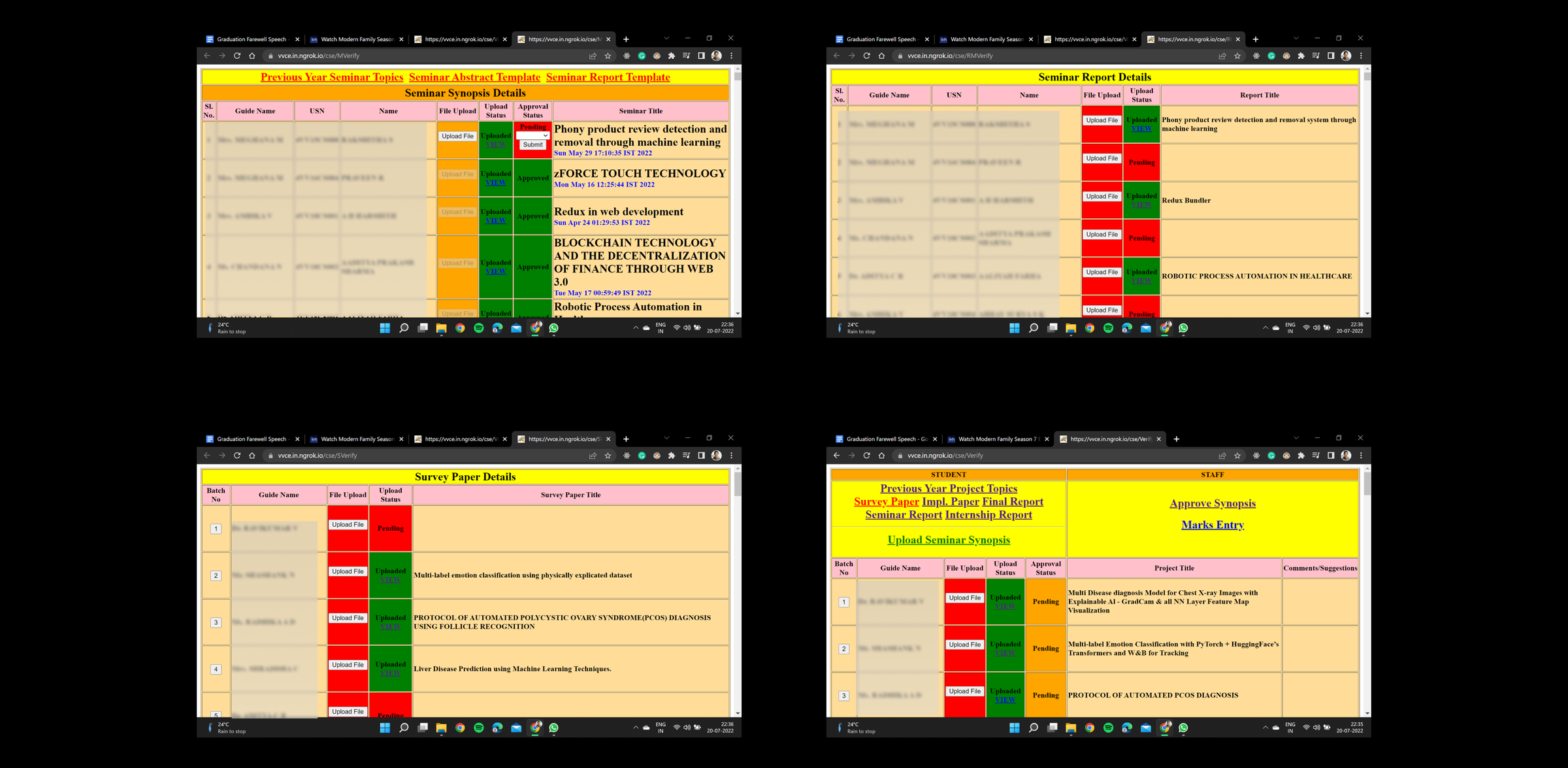
The links presented under the student column are visually cluttered.
Improper use of color representations for active links and text spacial issues that may cause the reader stress in locating the necessary link.
The student and Staff columns must be separated from each other on different screens because one screen must serve the purpose of one type of user.
The inconsistent color indicators across different in the same website used for indicating "uploaded", "pending", and "rejected".
Text capitalization is inconsistent throughout the website. One nomenclature should be followed.
Previous year projects descriptions and topics are presented in a document without the date details.
Last point, The design IS NOT INTUITIVE AT ALL!
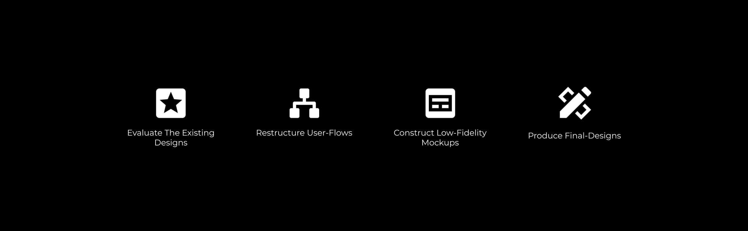
Whenever I create low-fidelity mockups, I do not go in-depth about the actual design implementation. I only lay out the necessary design structure that'll allow me to explore my ideas when I create high-fidelity mockups.
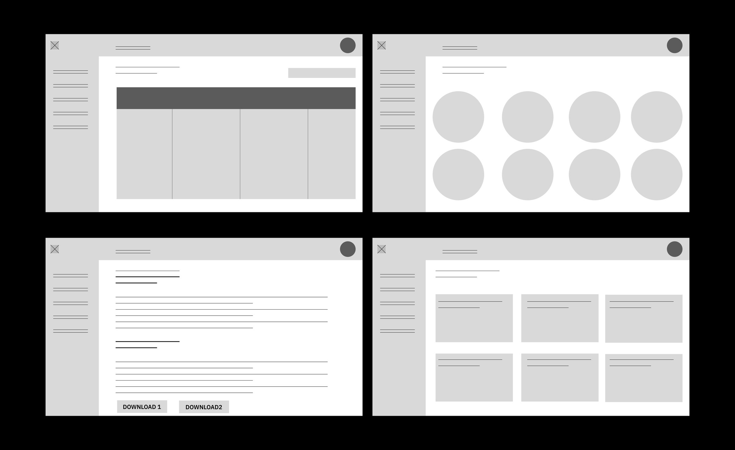
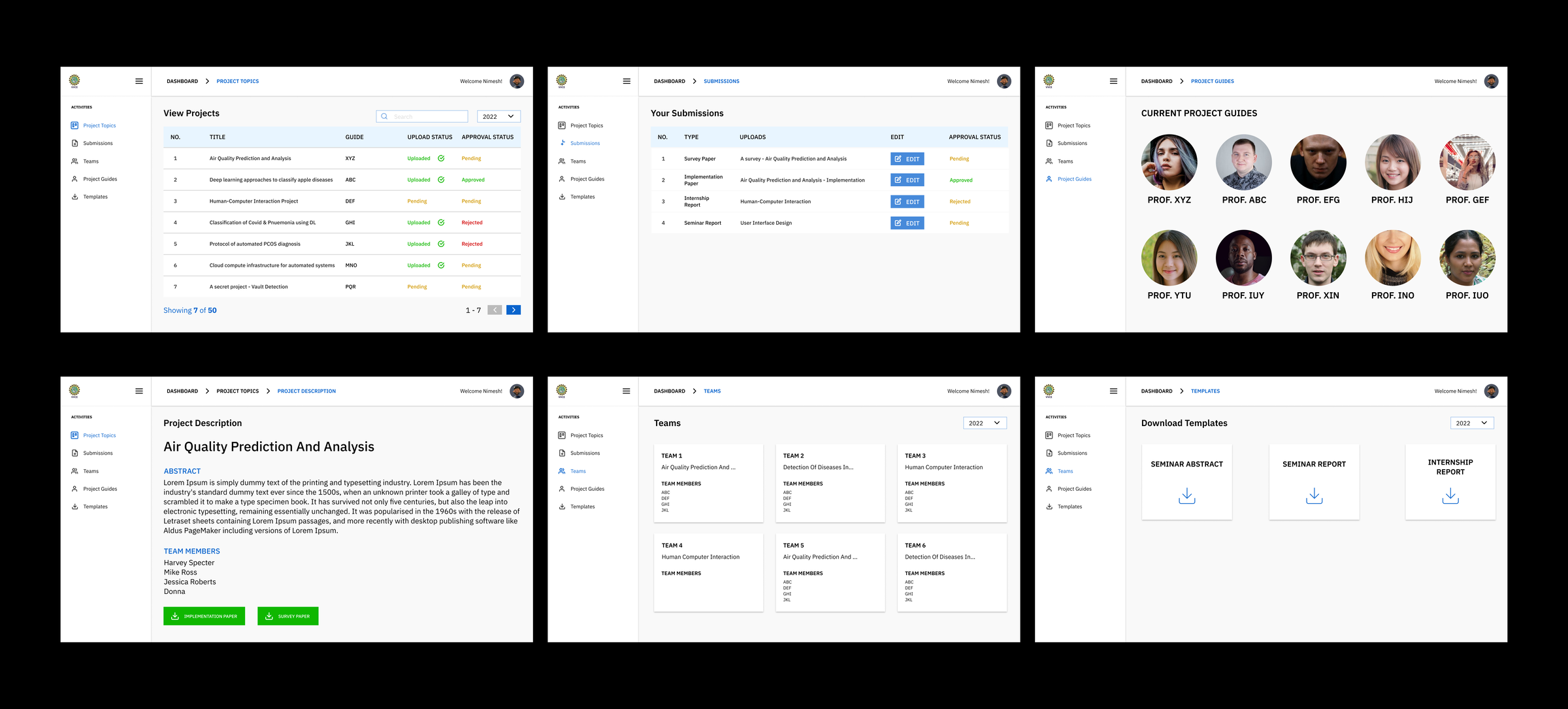
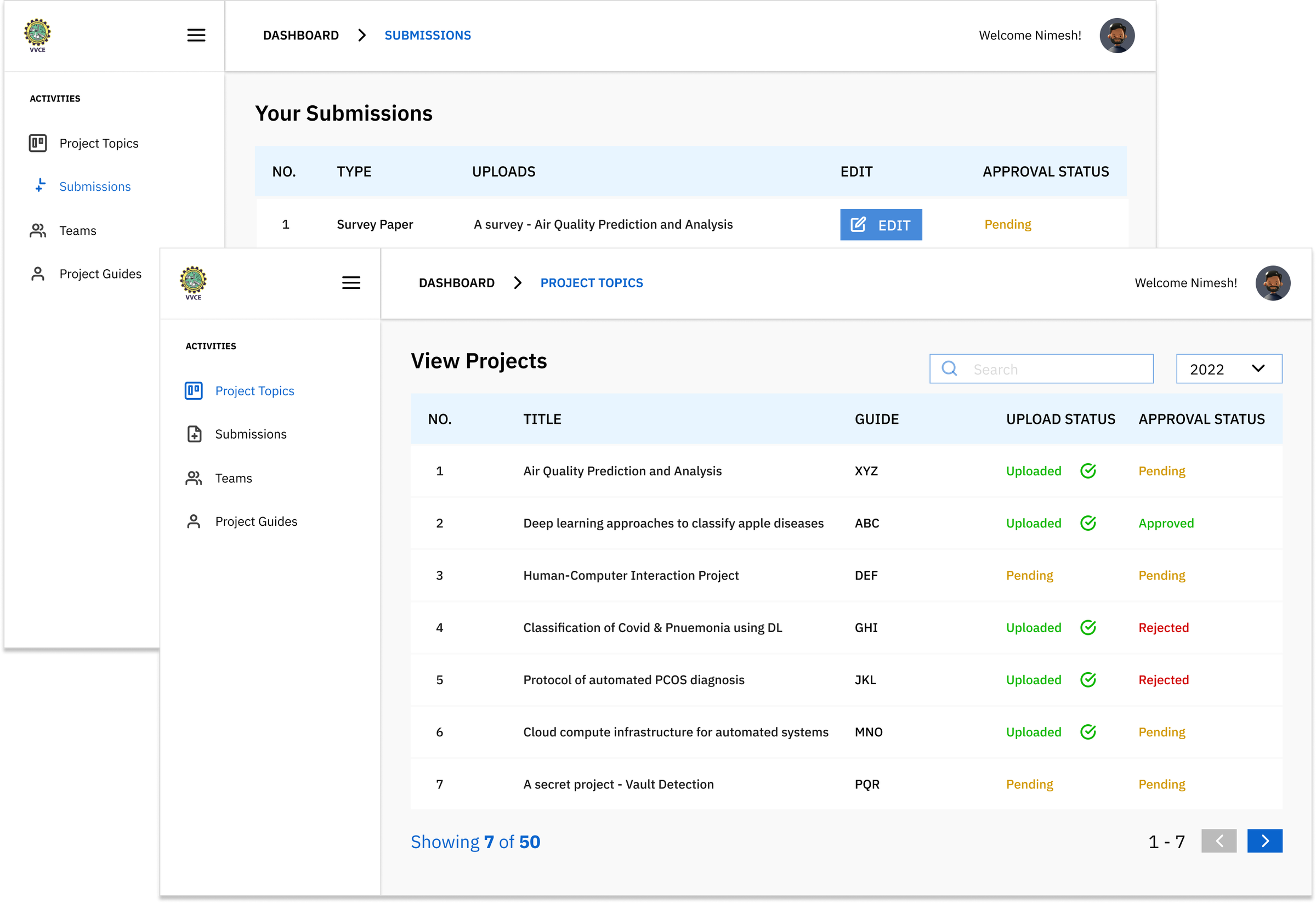
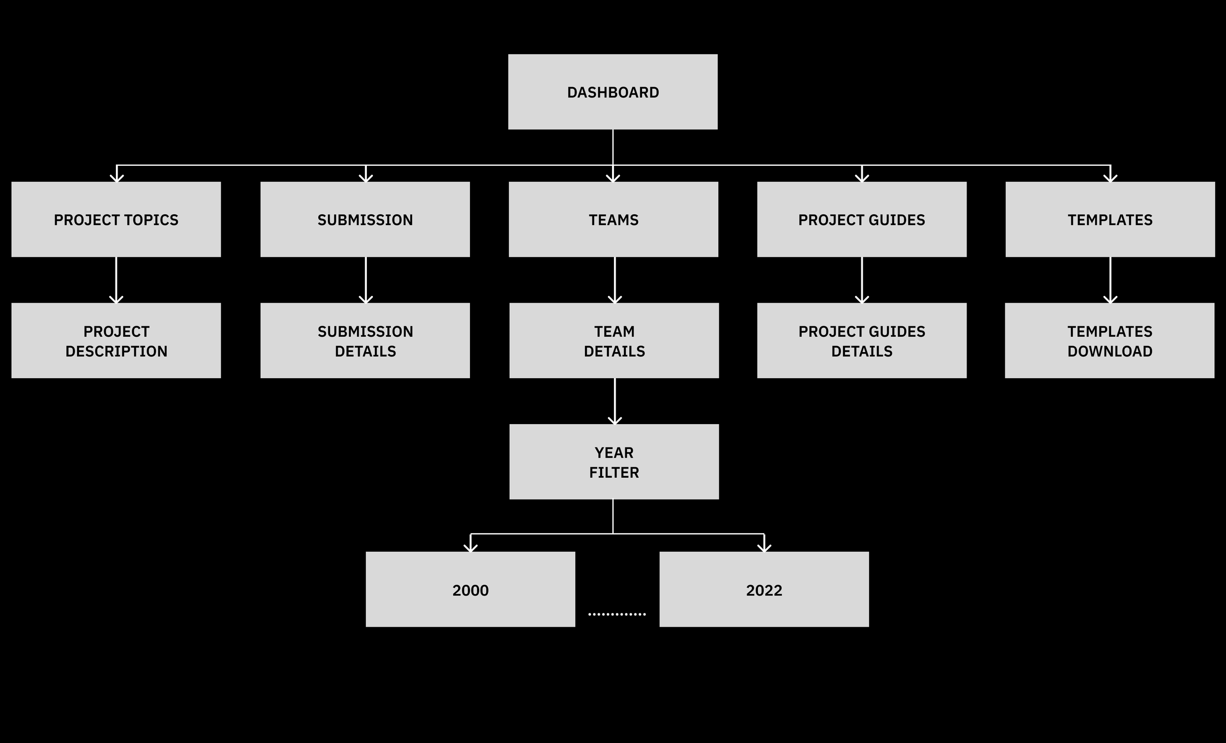
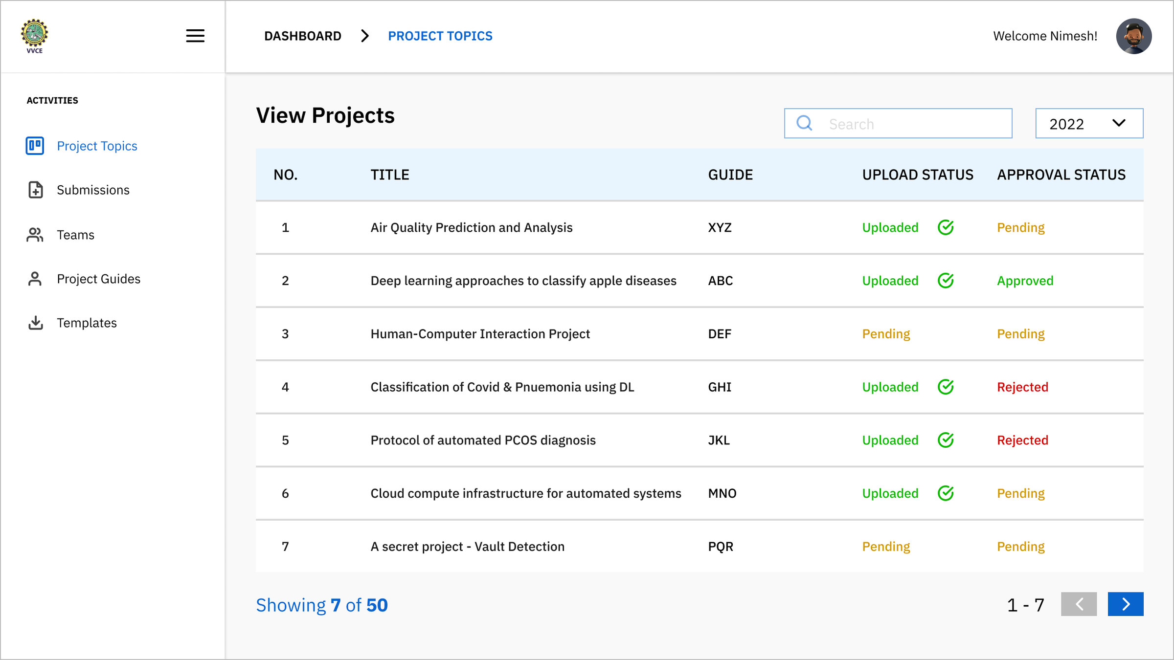
Introduction of tabular data to view projects done in the timeline
Students can filter the year and view the corresponding projects
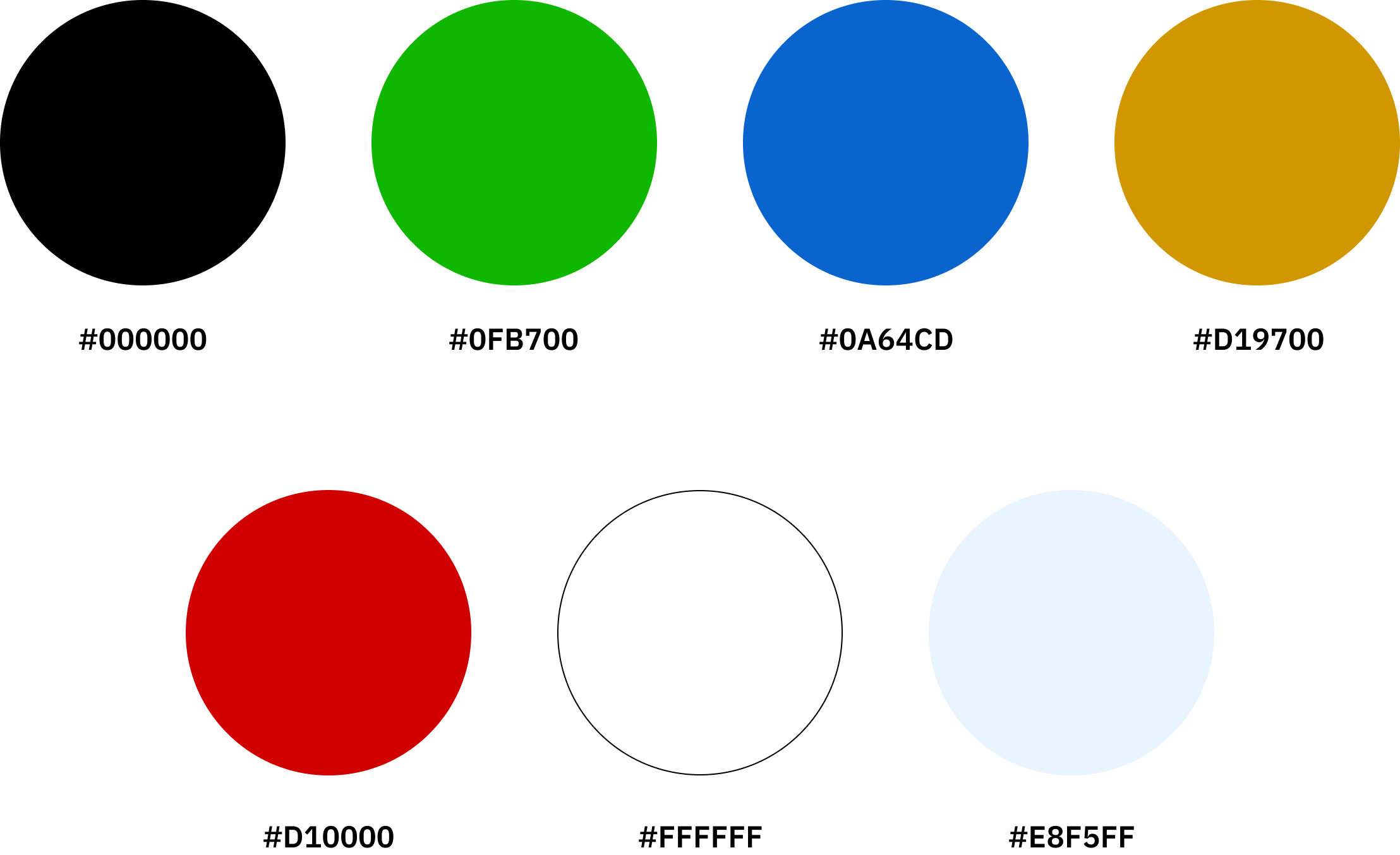
The text indicators' - "Approved,, Pending, Rejected" colors are consistent
Limited project list view so that the user can easily browse for lists of projects
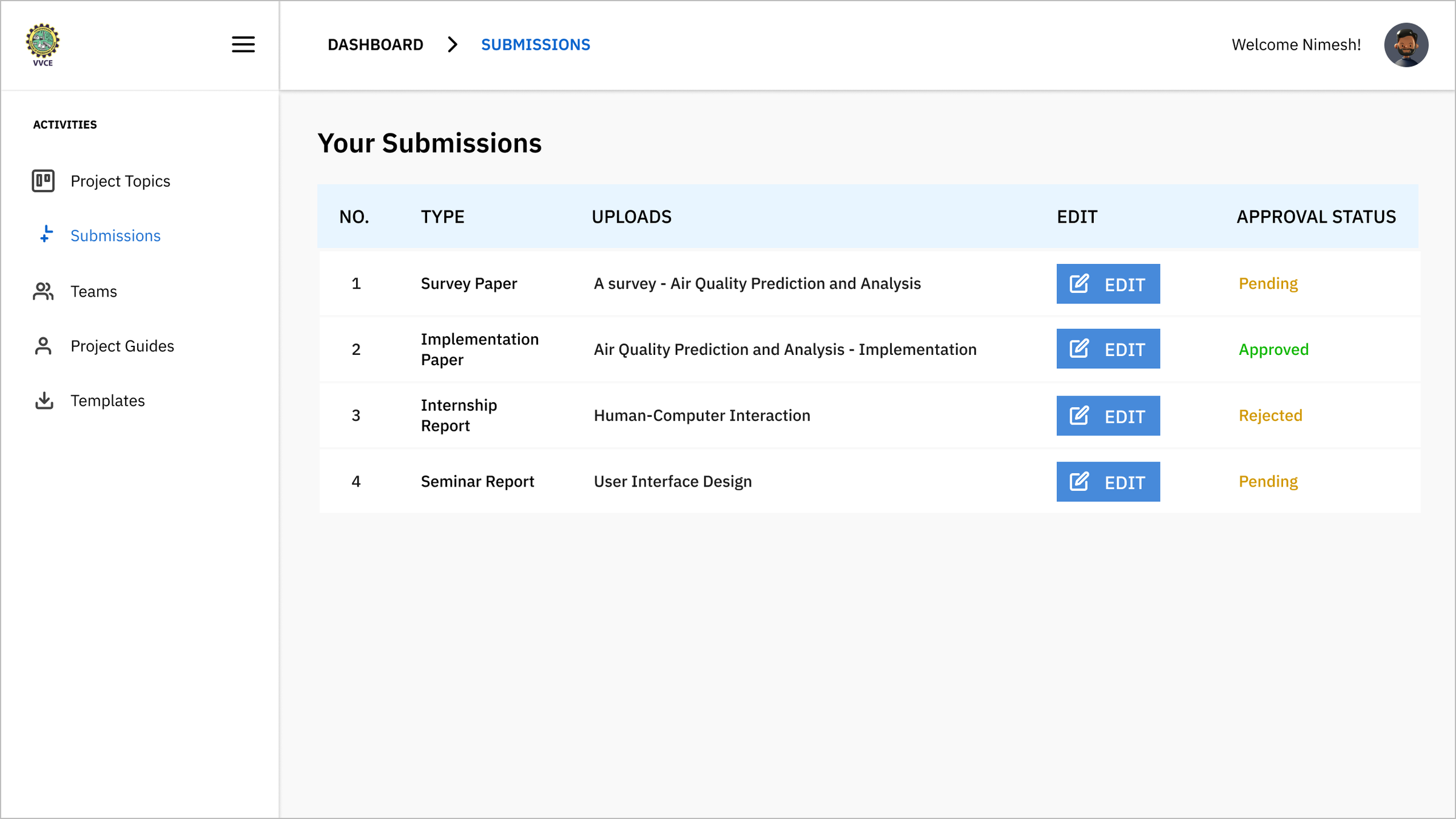
User can now see their uploads and edit the file document uploads.
The approval status determines their document submission state and they can easily figure out their status
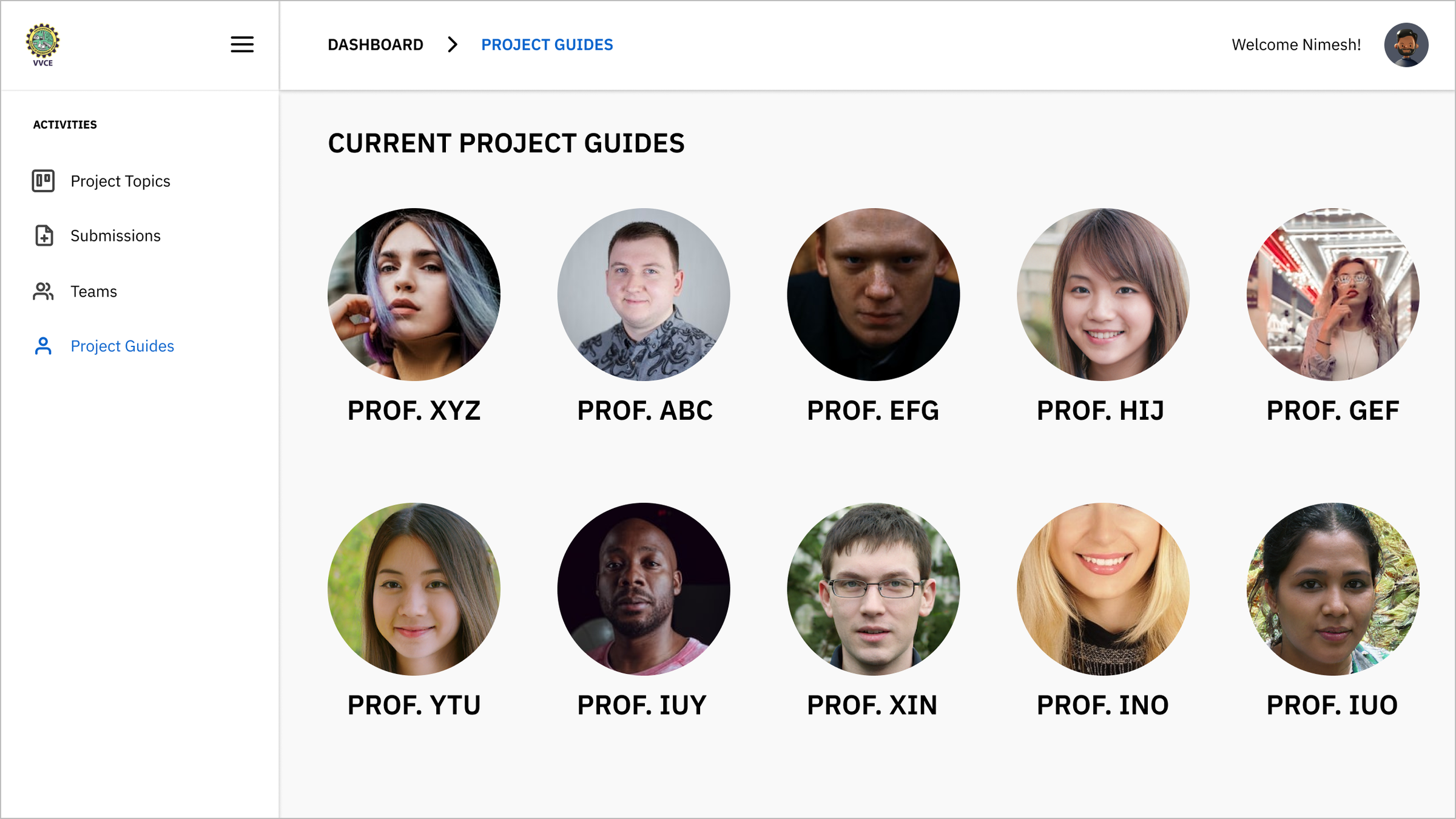
The guides page is simplified with all guides lists present on a different page.
The students can easily view all the guides for the current academic year
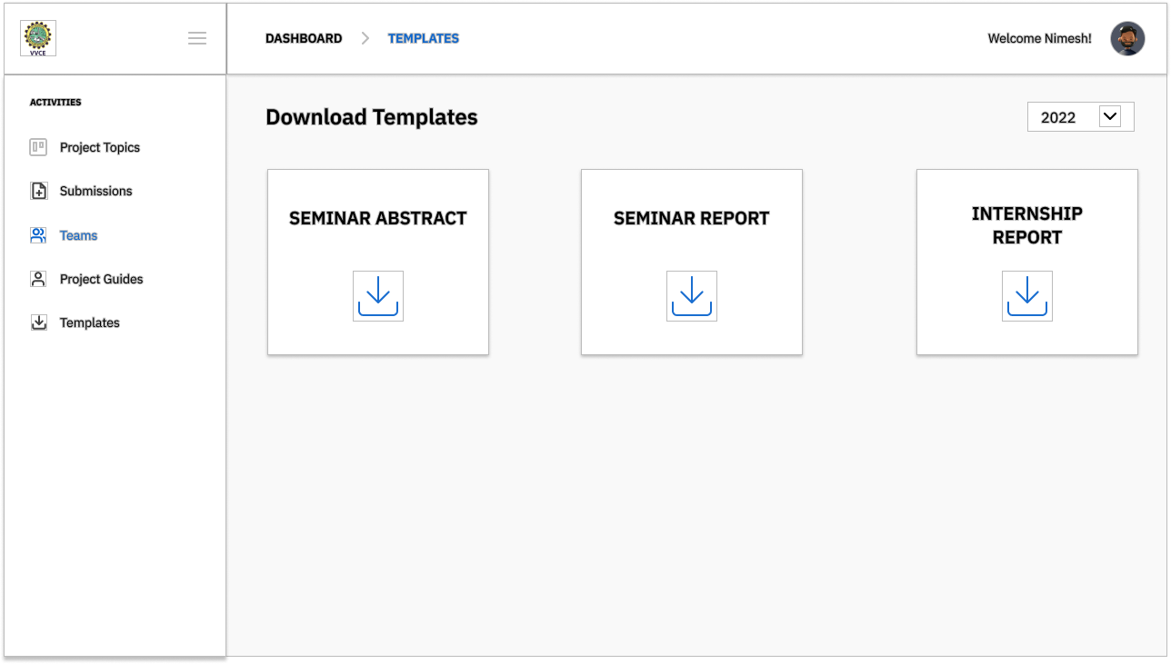
Students can now easily download all the templates.
The visual clutter is eliminated and the administrators can add any number of template download options. This provides flexibility.
It is important to provide easy access to information to the users and a simple user flow where the user won't feel perplexed navigating through the product.
It is also important to be considerate of visual clutter that may confuse the users when navigating through websites/digital products.
Be consistent when using colors and icons, especially when indicating different states of a task.